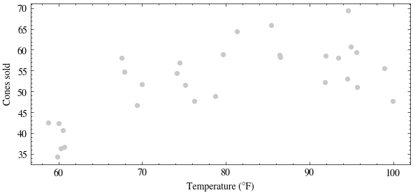
A month at the ice-cream stand: each day we record the temperature \(x\) and how many cones we sold. Nature generated these points from a hidden function plus noise, \[y = f(x) + \eta,\] and nature is not telling us \(f\). All we get is the scatter.
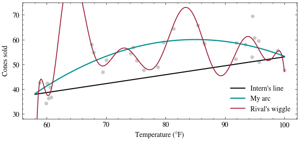
How do we judge “plausibly”? If a theory is right, then each day’s gap between the curve and the point is pure noise \(\eta\). A theory that requires huge gaps asks us to believe in a wildly unlikely run of noise. So as a first, crude plausibility score, add up the squared gaps; a smaller total is more plausible:
def score(curve, t, y):return np.mean((curve(t) - y) **2)print("mean squared gap, this month:")print(f" intern's line {score(line, temps, sales):8.1f}")print(f" my arc {score(arc, temps, sales):8.1f}")print(f" rival's wiggle {score(wiggle, temps, sales):8.1f}")# a fresh month of days from the same hidden processtemps2 = rng.uniform(58, 100, size=30)sales2 = hidden_f(temps2) + rng.normal(0, sigma, size=temps2.shape)print("\nmean squared gap, NEXT month:")print(f" intern's line {score(line, temps2, sales2):8.1f}")print(f" my arc {score(arc, temps2, sales2):8.1f}")print(f" rival's wiggle {score(wiggle, temps2, sales2):8.1f}")
mean squared gap, this month:
  intern's line       90.7
  my arc              26.8
  rival's wiggle       9.8

mean squared gap, NEXT month:
  intern's line      117.6
  my arc              19.2
  rival's wiggle     220.2
On this month’s data the rival’s wiggle wins: it threads the points, so its gaps are smallest. But on a fresh month from the same process the wiggle falls apart while the arc’s score barely moves. The wiggle fit the noise in the month it was shown, not the process behind it. (A whole lecture, Methodology, is devoted to this trap.)
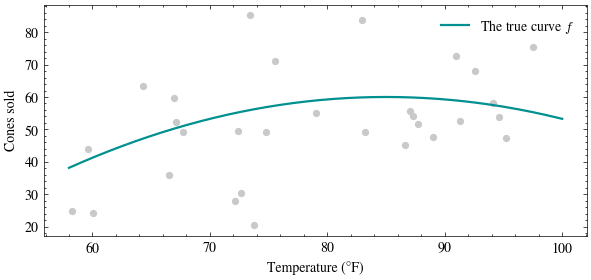
And here is the reveal: nature’s hidden function was the arc, \(f(x) = 60 - 0.03(x - 85)^2\). Yet even the true curve misses every day by about \(\sigma = 5\) cones; its mean squared gap hovers near \(\sigma^2 = 25\), and no curve can beat that on fresh data.
What if nature were noisier?
Turn the one knob nature has: \(\sigma\). Try sigma = 0 (a world with no birthday parties) and sigma = 15 (chaos).
true curve's mean squared gap: 227.9 (sigma^2 = 225)
Punchline: even the true function misses by the noise, so zero error is not the goal, and a model that reaches it has fit the day-to-day luck instead of the pattern. The best any predictor can do is the conditional mean \(\mathbb{E}[Y \mid X = x]\), and Problem 5 proves its error floor \(\mathbb{E}[\mathrm{Var}(Y \mid X)]\) exactly. Next lecture, today’s crude “sum of squared gaps” score stops being crude: it falls out of maximum likelihood as a theorem.