Regression
One summer in college, I scooped ice cream at a stand that threw away melted inventory every night. The owner’s ordering strategy was to look at the sky, mutter, and guess. Some days we ran out by noon; other days we poured gallons of mint chip into the dumpster. He was solving, badly, the problem this unit solves well: predict tomorrow’s sales from what you can observe today.
Welcome to the Linear Models unit, where the machine learning begins. The last unit stocked two toolboxes, probability and linear algebra; this unit puts both to work, starting with the goal itself: regression. Today we ask the question the whole unit answers:
By the end of the note the second half has an exact answer, and it is not “zero error.”
Supervised Learning
In supervised learning, we observe examples that have already been labeled with the right answer, and our job is to predict the labels of examples we have not seen. Concretely, we are given a dataset of \(n\) data points: \[ (\mathbf{x}^{(1)}, y^{(1)}), \; (\mathbf{x}^{(2)}, y^{(2)}), \; \ldots, \; (\mathbf{x}^{(n)}, y^{(n)}), \] where each \(\mathbf{x}^{(i)} \in \mathbb{R}^d\) is a vector of \(d\) features (the measurements we get to observe) and each \(y^{(i)} \in \mathbb{R}\) is the label (the answer we want to predict). The goal is to learn a function \(f: \mathbb{R}^d \to \mathbb{R}\) with \(f(\mathbf{x}) \approx y\) on new examples, not just on the data we were handed.
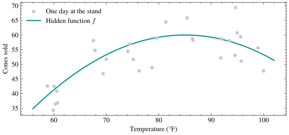
At the ice-cream stand, a feature vector might collect today’s temperature, the day of the week, and whether school is out; the label is the number of cones we will sell. For most of this unit we keep the example univariate (one feature, temperature) because we can draw it, and in that case we drop the boldface and write \(x\) for the single feature.
The type of the label splits supervised learning in two:
Regression: the label is a real number, such as cones sold, tomorrow’s temperature, or a house price.
Classification: the label is a category, such as spam or not spam, which digit is in the image, or which word comes next.
This lecture and the next four are about regression; classification arrives at the end of the unit and shares almost all of the machinery. Either way, we cannot yet say which function \(f\) is a good one, because we have not said where the labels come from.
The Best Possible Prediction
Suppose, for a moment, that we cheat: forget finite datasets and take the entire joint distribution of \((X, Y)\) as known. The question sounds artificial, but its answer is the target every algorithm in this unit aims at.
The in-class exercise works it out on an example small enough to do by hand. At the stand, suppose the weather \(X\) is cloudy or sunny and the day’s sales \(Y\) are either \(10\) or \(30\) cones, with joint probabilities:
| \(Y = 10\) | \(Y = 30\) | |
| $X = $ cloudy | \(0.30\) | \(0.10\) |
| $X = $ sunny | \(0.15\) | \(0.45\) |
Two predictors are worth comparing: one that ignores the sky and one that looks at it. Start with the forecaster who ignores it and announces the same number every day. The best such constant under squared error is the overall mean (Problem 5 Part A proves this), and summing the table down each column gives the marginal distribution of \(Y\) and hence that mean: \[ \mathbb{E}[Y] = 10 \cdot (0.30 + 0.15) + 30 \cdot (0.10 + 0.45) = 10 \cdot 0.45 + 30 \cdot 0.55 = 21 . \] Its expected squared error is then the variance of \(Y\), since the variance is by definition the expected squared distance from the mean: \[ \mathbb{E}\big[(Y - 21)^2\big] = \mathrm{Var}(Y) = 0.45 \cdot (10 - 21)^2 + 0.55 \cdot (30 - 21)^2 = 54.45 + 44.55 = 99 . \]
But we can see the sky, and conditioning is exactly the tool for using it. Summing the table across each row gives \(\Pr(X = \text{cloudy}) = 0.4\) and \(\Pr(X = \text{sunny}) = 0.6\), and dividing each entry by its row sum gives the conditional distribution of \(Y\) within that kind of day. On cloudy days \(Y\) is \(10\) with probability \(0.30/0.4 = 0.75\) and \(30\) with probability \(0.10/0.4 = 0.25\); on sunny days the two probabilities swap. Averaging \(Y\) inside each row gives the two conditional means: \[ \mathbb{E}[Y \mid X = \text{cloudy}] = 10 \cdot 0.75 + 30 \cdot 0.25 = 15, \qquad \mathbb{E}[Y \mid X = \text{sunny}] = 10 \cdot 0.25 + 30 \cdot 0.75 = 25 . \] Now consider the predictor that answers \(15\) on cloudy days and \(25\) on sunny days. On a cloudy day its expected squared miss is the spread of \(Y\) around \(15\), and on a sunny day the spread around \(25\), so its overall error is the average of the two conditional variances, weighted by how often each kind of day occurs: \[ \begin{align*} \mathrm{Var}(Y \mid X = \text{cloudy}) &= 0.75 \cdot (10 - 15)^2 + 0.25 \cdot (30 - 15)^2 = 18.75 + 56.25 = 75, \\ \mathrm{Var}(Y \mid X = \text{sunny}) &= 0.25 \cdot (10 - 25)^2 + 0.75 \cdot (30 - 25)^2 = 56.25 + 18.75 = 75, \\ \mathbb{E}\big[\mathrm{Var}(Y \mid X)\big] &= 0.4 \cdot 75 + 0.6 \cdot 75 = 75 . \end{align*} \] Conditioning cut the error from \(99\) to \(75\), and the \(24\) it saved is exactly the variance of the conditional mean itself: \[ \mathrm{Var}\big(\mathbb{E}[Y \mid X]\big) = 0.4 \cdot (15 - 21)^2 + 0.6 \cdot (25 - 21)^2 = 14.4 + 9.6 = 24, \qquad 99 = 75 + 24 . \] A feature helps exactly as much as it swings the conditional mean around; the spread left inside a single kind of day is invisible to any predictor that sees only \(X\). What would the same split look like for a feature that pinned \(Y\) down exactly?
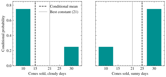
In the plot, each panel shows the conditional distribution of sales for one weather condition, with the conditional mean marked in black and the best constant guess \(21\) in gray. The constant sits between the two panels and is wrong in both, while the conditional mean moves with the evidence.
This example is the whole theory in miniature. Define the regression function to be the conditional mean of the label given the features: \[ f^*(x) = \mathbb{E}[Y \mid X = x] . \] It is the best possible predictor under squared error, and its expected squared error also has a name: \[ \mathbb{E}\big[(Y - f^*(X))^2\big] = \mathbb{E}\big[\mathrm{Var}(Y \mid X)\big] , \] the irreducible error, a floor that no model, however clever, and no dataset, however large, can get below. Problem 5 proves both facts in full generality with one add-and-subtract, and the floor it establishes reappears term for term when we decompose test error in the Methodology lecture.
That floor should bother you. We are constantly told that a big enough model trained on enough data can fit anything, so where does a positive floor come from? The floor is an average of conditional variances, the spread of \(Y\) that survives after \(X\) is known, so it counts exactly the part of the label our features cannot see. It is a property of the joint distribution, not of the model or the dataset: it does not grow when the relationship is complicated, does not shrink when we collect more days, and drops only when we measure something new. The moral: learning is estimating a conditional mean, and zero test error is not the goal. Even the perfect forecaster misses; the skill is in missing by no more than \(\sqrt{\mathbb{E}[\mathrm{Var}(Y \mid X)]}\). All of this rested on knowing the joint distribution, which is the one thing we never have.
Model Classes
Back in the real world we hold \(n\) samples from that distribution rather than the distribution itself, so we cannot compute \(\mathbb{E}[Y \mid X = x]\) from a formula we do not have. Worse, with finitely many points we cannot hope to recover an arbitrary function: infinitely many functions pass through any finite scatter.
The escape is to stop searching over all functions and commit to a model class (also called a hypothesis class), a menu \(\mathcal{F}\) of candidate functions from which we will select one. Each candidate \(f \in \mathcal{F}\) is a hypothesis about how features relate to labels. Some menus we will order from this semester:
Constant functions: \(f(\mathbf{x}) = c\) for a single number \(c \in \mathbb{R}\), which is the mutter-and-guess strategy.
Linear functions: \(f(\mathbf{x}) = \langle \mathbf{w}, \mathbf{x} \rangle\) for a weight vector \(\mathbf{w} \in \mathbb{R}^d\), the star of this unit, with one parameter per feature.
Neural networks: compositions of linear maps and simple nonlinearities, the star of the next unit, with millions of parameters.
Choosing the class is a modeling decision: it encodes what we believe about the hidden function before seeing much data. A class that is too small cannot express the truth, since no straight line can climb and then sag the way the ice-cream curve does; we will see later in the unit what goes wrong when the class is too large. Committing to a class narrows the search to something finite-dimensional, but it does not say which item on the menu to order.
The Most Likely Function
Given a model class and a dataset, which hypothesis should we select? Our intuition already has an answer worth listening to.
Picture two curves fit to the same scatter of days: one a plausible guess at the truth, the other an elaborate curve that threads every point exactly. Under the plausible curve, the observed points are the kind of thing that would actually happen; under the curve that threads every point, the noise \(\eta\) would have had to land in a suspiciously cooperative pattern rather than at random.
That instinct has a name. The maximum likelihood principle says to select the hypothesis under which the observed data was most probable: \[ \hat{f} = \arg\max_{f \in \mathcal{F}} \; \Pr\big(y^{(1)}, \ldots, y^{(n)} \mid f\big) , \] where the probability is over the noise in each label with the features held fixed, and the hat marks \(\hat{f}\) as our estimate of the target function \(f\). This is the single idea we will use to choose functions for the rest of the course: for regression this week, for classification in two weeks, and for an agent playing games in the final unit. The demo puts three such curves against the same scatter and scores each by plausibility: the curve that threads every point wins on the data it was fit to and can still lose on the next batch, the trap the Methodology lecture is devoted to. And the instinct does not yet tell us how to score plausibility with a number we can minimize.
Looking Forward
Next lecture makes the first move toward the target we set today. We will write down the probability of the dataset under Gaussian noise, take one logarithm, and out will fall the quantity the demo has been scoring curves with all along: the average squared gap between predictions and labels. The choice of loss, in other words, is a claim about the noise rather than a matter of taste.
If you carry one sentence out of today, carry this one: every prediction problem has a best possible answer, the conditional mean, sitting on a floor, so the goal is not zero error but the part of the label the features can explain.